|
|

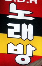
The left-leaning serif at the top appears to be an embellishment, but the tick mark on the side is the difference between “A” and “I”. I think the serif on the top of the circle is embellishment.
|

Sans-serif, and with a squared circle.
|

Here, the side tick on the vowel is really high, and the circle has a full-on hat. Is this actually “han?” 한 I’m not sure.
|

|

|

|

|

|

|

|

|

|

|

|

|

Italics?
|

I think the extremely sketchy style of this one excuses the fact that it’s not “an” at all, but “eon.” The tick mark off the vertical stroke is to the left, not the right. DIfferentl letter.
|

A lot of my “an” glyphs are actually “in”. The difference is the lack of a tick mark on the vertical stroke.
|

A curved stroke on the horizontal letter!
|

|

|

|

|

|

Hangul with shades of Optima.
|

|

|

|

|

|

|

|

This sign has both 인 (“in”) and 주 (“ju” which my brain keeps calling “KT”).
|

The modern form of ju is symmetric.
|

Not having the legs of the top component meet was unusual.
|

|

|

|

This version hints at the older brush-stroke-based letter form.
|

Here the original brush strokes of the top symbol are clearly evident.
|

|

|

|

|

|

Is the bump on the top important? I don’t know. There’s a good chance that the top symbol is actually ㅊ instead of ㅈ
|

|

|

|

|

|

|

Here, the top ‘word’ is ㅈ over ㄱ, and the bottom ‘word’ is ㅊ next to ㅏ. And yea, that totally looks like a little guy holding a stick.
I also enjoyed seeing stencil support lines cutting across the letters.
|

|

|

|

|

|

|

|

|

|

Oops! This isn’t ‘ju,’ it’s ‘jo.’ The “T” on the bottom is upside-down.
|

And this one isn’t ‘ju’ either, it’s ‘su.’ No cross bar on the top symbol.
|

No cross bar, AND upside-down “T”. This one is “so.”
|
The rest of these pictures are of sign elements I found interesting even though they didn’t have a “ju” or “an” on them.

|

|

|

|

|

|

I could not possibly resist Tolkein-esque Hangul writing!
|

|

This seems incredibly abstracted to me.
|

|

|

|

|

Really unusual stroke ends.
|

|

|

|

Awfully dismaying, I must say.
|

|

|

This was especially interesting, since the name of this establishment is transliterated: 상 상 is “Sang sang”.
|

Ignore the iconic humanoid dancing in the middle. This version of the sign has the letters of each syllable arranged very untraditionally, as if they were Engish or the like, and the horizontal tick on the vertical stroke has moved from the very bottom, to the top.
|


